Éclat Aesthetica
The whole brand for a new med spa, and the site it lives on: a logo system, a brand book, the photography, and a website that takes bookings. Five weeks, start to finish.
One point of contact. The client's only job was to say yes.

- Client
- Éclat Spa & Wellness
- Year
- 2026
- Status
- Live
Before
A lease, two lasers, no brand.
A new medical spa in Phoenix had a lease, two lasers, and no brand. No logo, no colors, no typography, no photography, and no website — and a grand opening already on the calendar. Everything a patient would use to decide whether to trust them with their face had to exist, and it had to exist at once.
- NoneLogo
- NoneColors
- NoneTypography
- NonePhotography
- NoneWebsite
The site
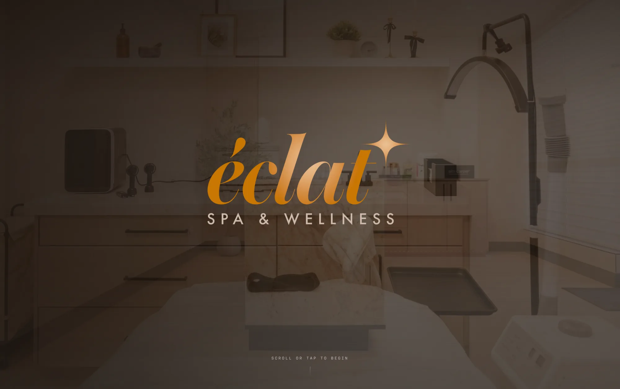
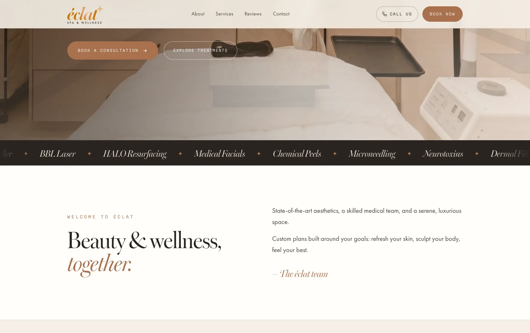
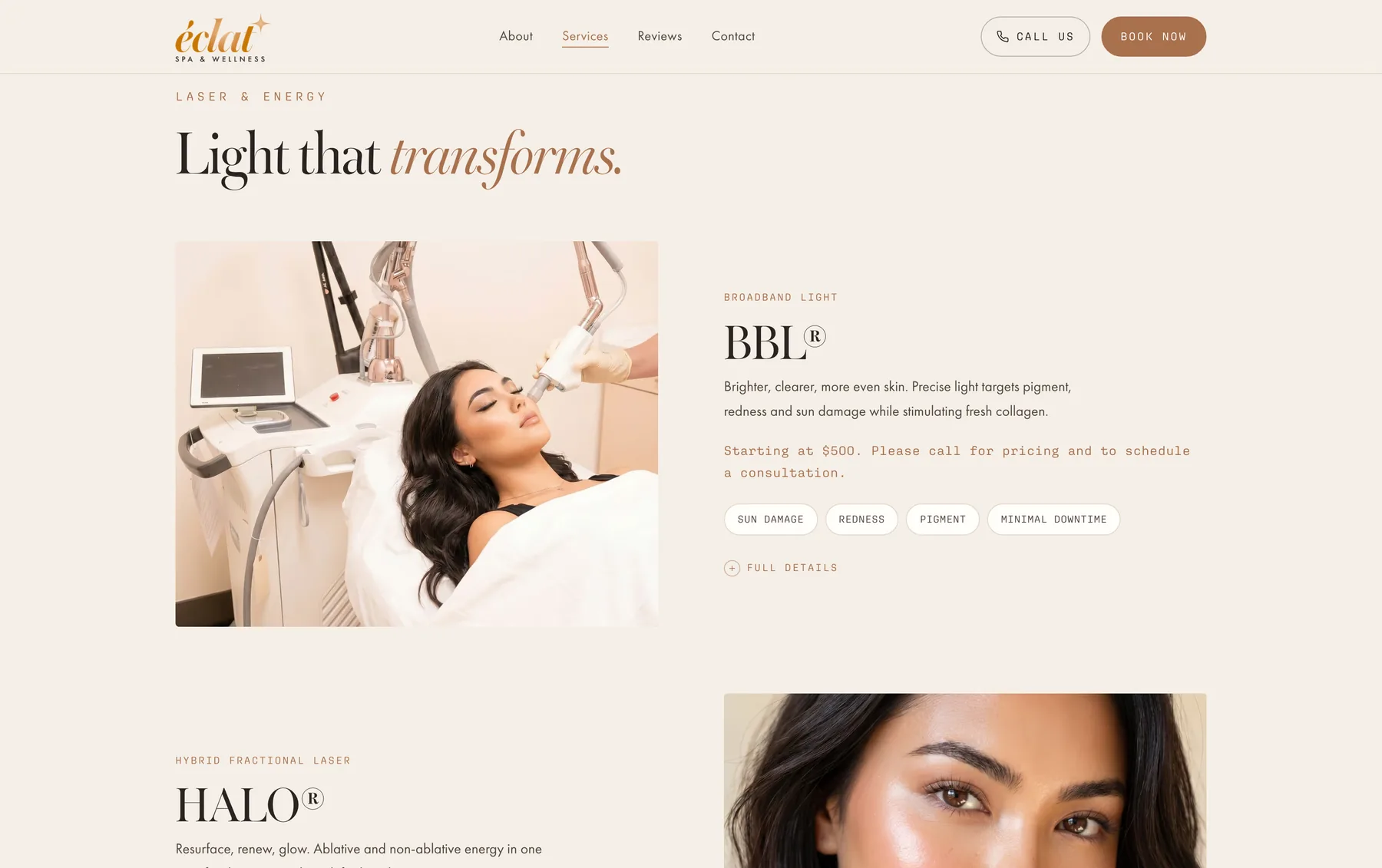
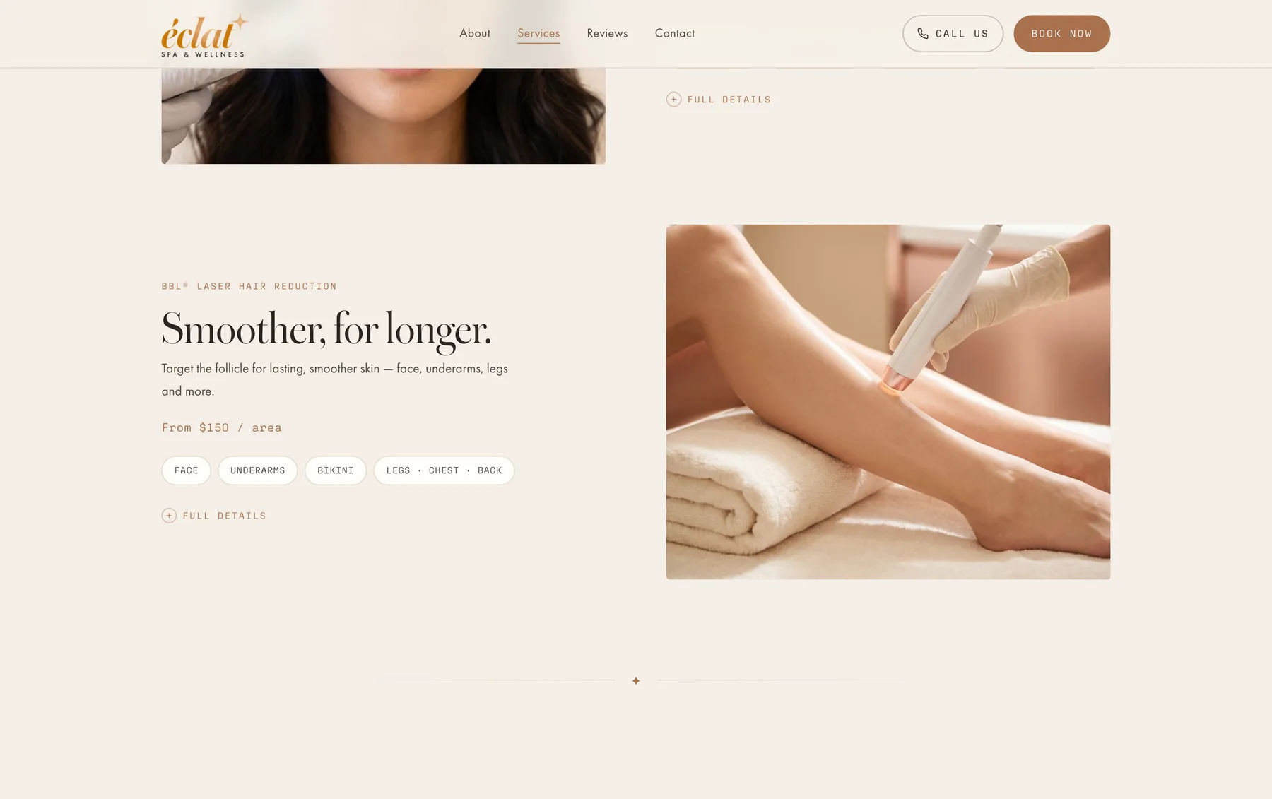
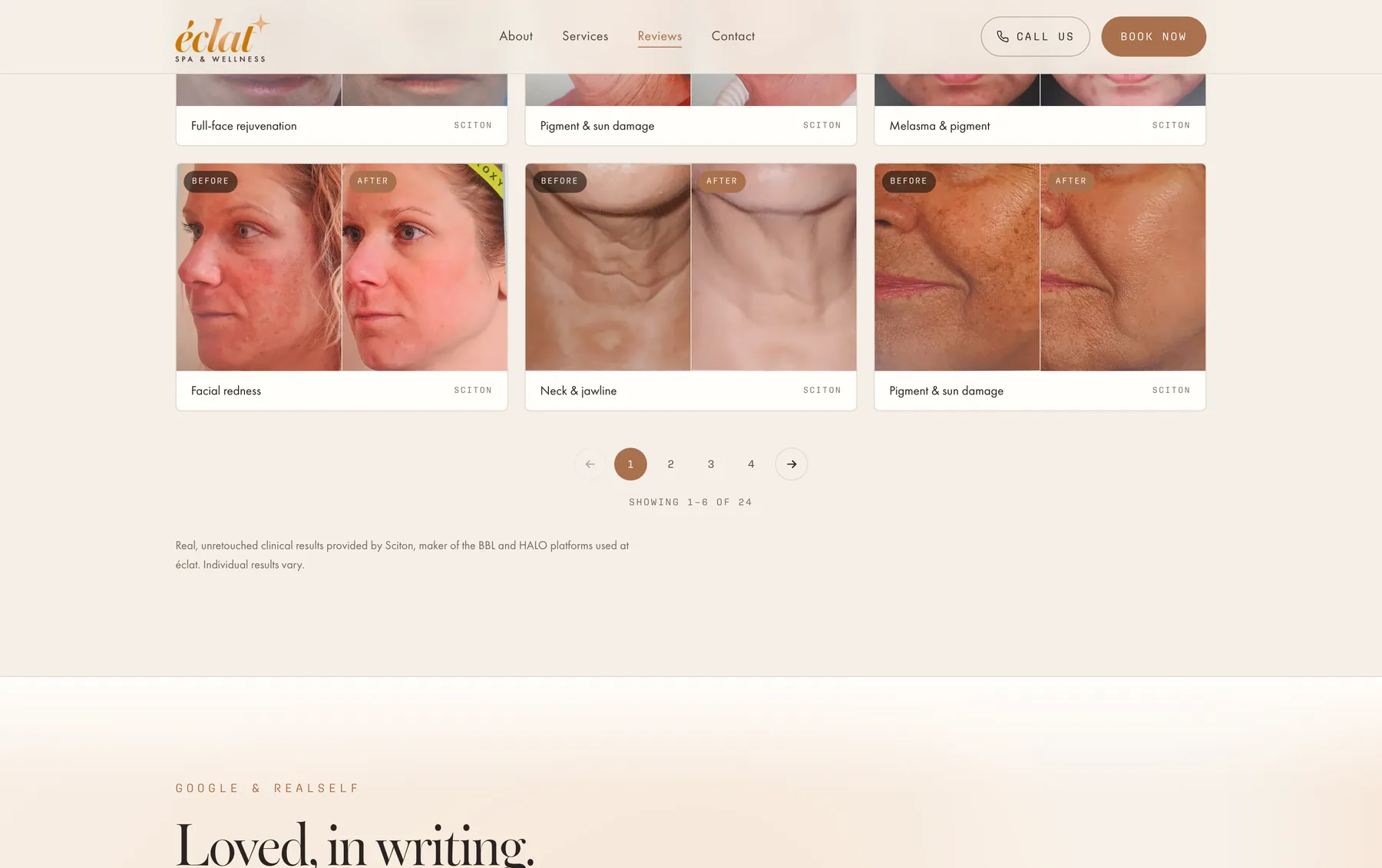
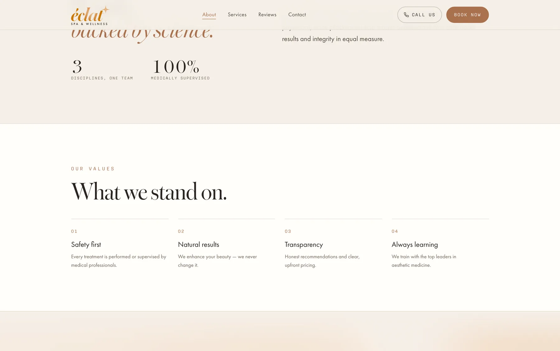
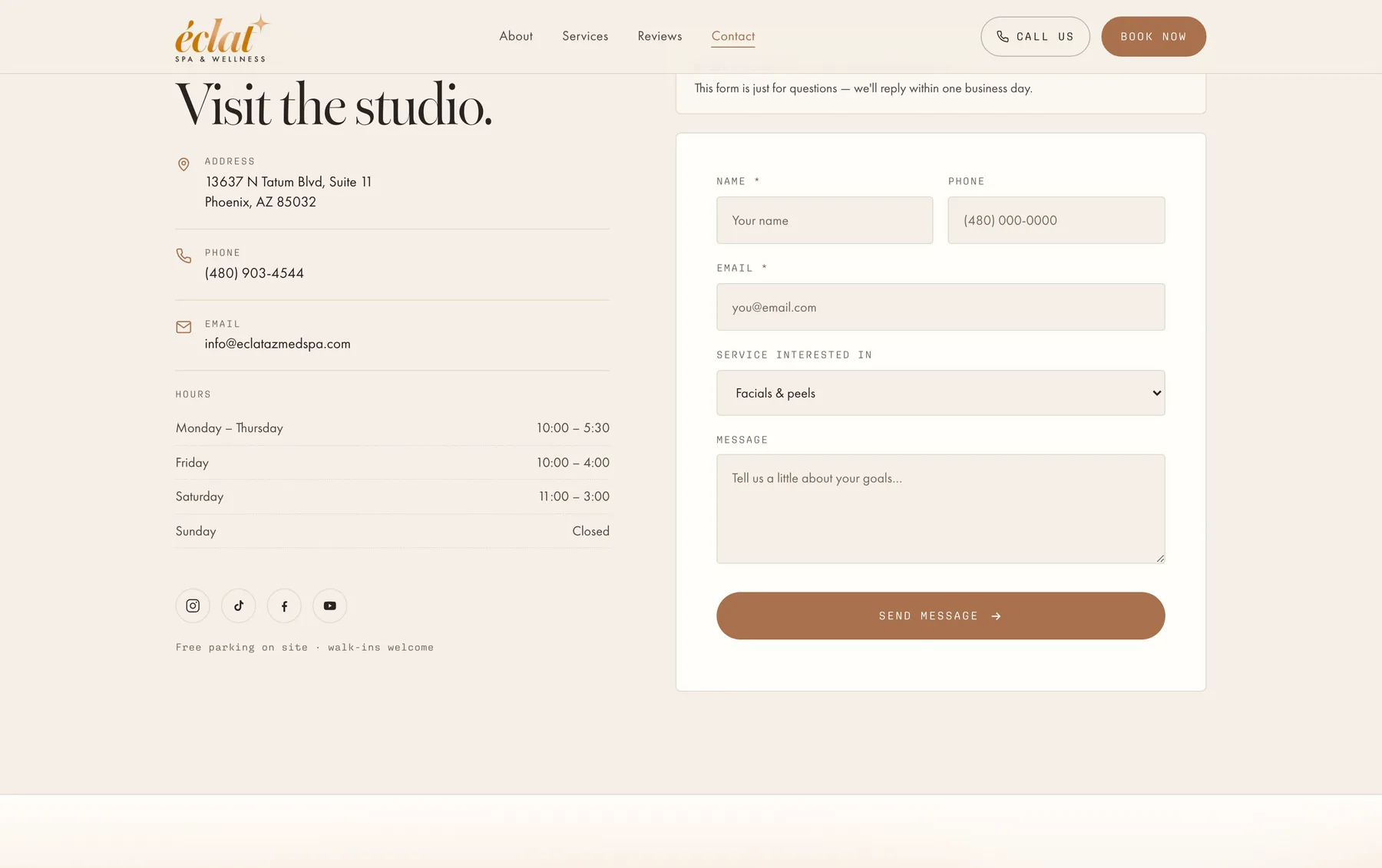
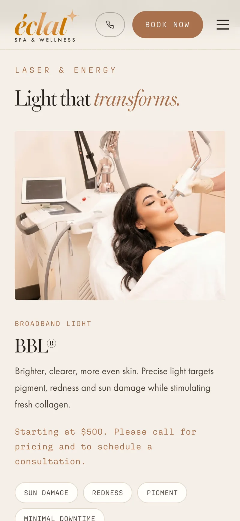
Plate ISeven pages, live right now at eclatazmedspa.com: a scroll-pinned hero, the treatment catalog, clinical before-and-afters, and a booking path wired to the spa's own scheduler. A stranger can book an appointment on it today — go and check.

The mark
Plate IIUnder all of it: one layered master. Four lockups, five colorways, and a brand book that says which one goes on a sign, which one goes in an email signature, and what the colors are called.


- 4Lockups
- Wordmark
- Simple
- Horizontal
- Stacked
- 5Colorways
- RGB
- Ink
- Cream
- Black
- White
- 2Formats
- SVG
- PNG
- 40Files delivered
Four lockups, in five colorways, in two formats: forty files delivered.
The toolchain
Plate IIIA logo has to hold at thirty-two pixels in a browser tab and at four feet across a building. That only works as real vector art, so the mark is built, not exported: a layered master and outlined type in, a tracer and a gradient solve over them, forty files out.
01 Master
- Layered PSDOne source of truth(Source)
- Font outlinesopentype.js, no fonts to ship(Source)
02 Trace
- potraceRaster → vector paths(Process)
03 Fit
- Gradient solveLeast-squares, pixels → linearGradient(Model)
04 Build
- 4 lockupsWordmark, simple, horizontal, stacked(Process)
- 5 colorwaysRGB, ink, cream, black, white(Process)
05 Ship
- SVG + PNG40 files, both formats(Output)
- Brand bookPDF, client-facing(Output)
The rose-gold sweep across the wordmark is a live SVG gradient. potrace gives you flat paths, so the sweep is least-squares fitted back out of the source pixels and rebuilt as a linearGradient: colour stops and an angle, with no resolution left to run out of.
The rooms
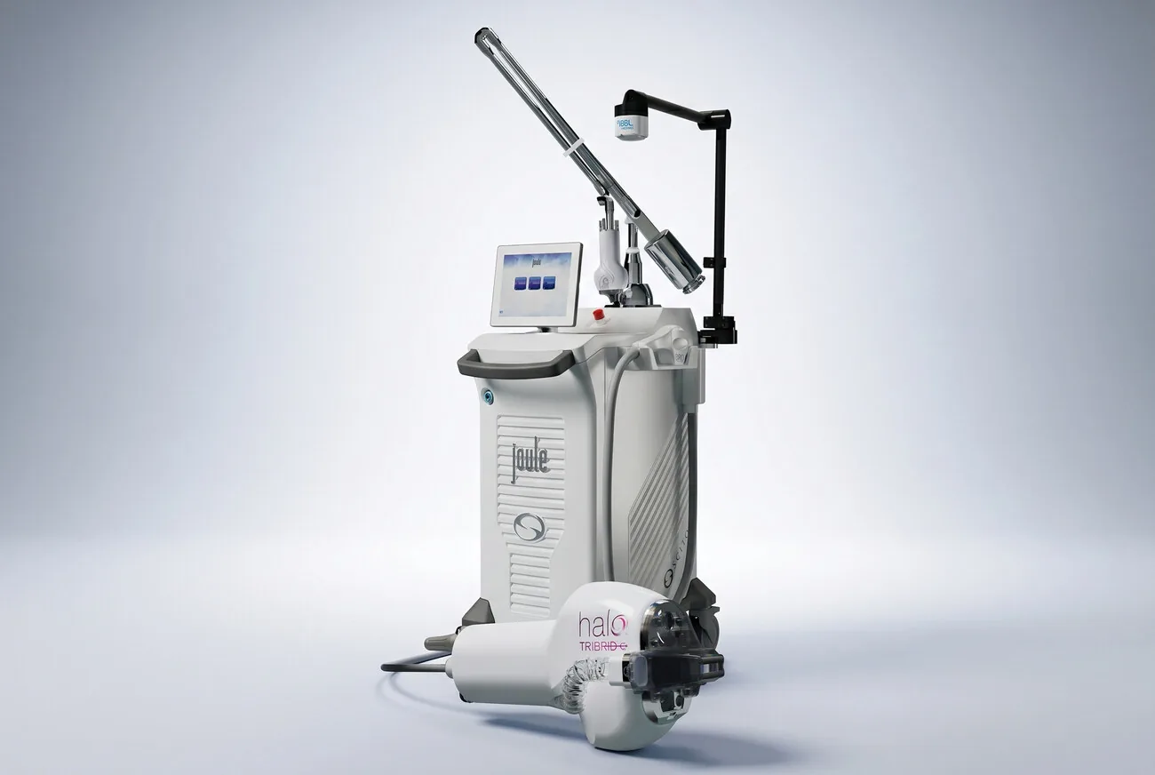
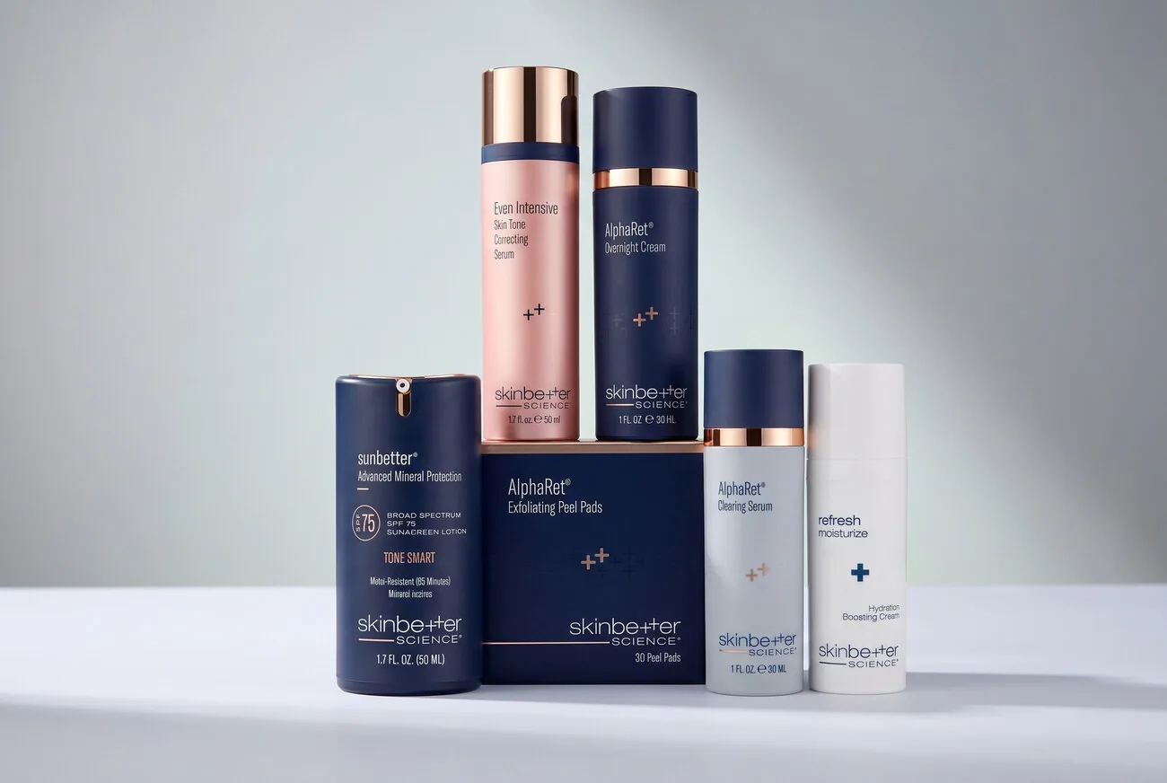
Plate IVA photography direction, then the shoot: the spa's own rooms, its own reception, and an editorial still life for each retail line. Every photograph on the site above is one of these.
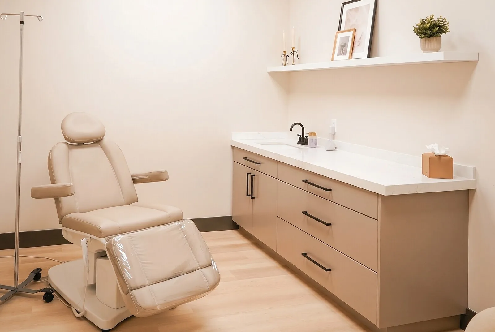
The rooms are real. Shot on location, straightened and graded.

Colophon
Outcome- Concept to live
- 5 wks
- Pages shipped
- 7
- People to manage
- 1
Logo, colors, typography, photography, website. Every one of those was missing at the start, and every one of them shipped. It is theirs to run now: the last commits on the repo are their pricing and their opening hours, not mine.
Role
Solo, and all of it: the identity, the logo system and its build toolchain, the brand book, the photography direction and the shoot, the design, the front end, the SEO, and the deploy.
- Contrast
- AA, measured per token
- Built with
- Next.js 16 · React 19 · TypeScript · Tailwind CSS v4 · Motion · Mangomint · Resend · Vercel · Adobe Fonts · potrace · opentype.js · Photoshop
Start a project
What do you need built?
Tell me what the thing has to do and who has to use it after I leave. We'll get on a call, and I'll tell you what it takes.
Start a project